05/1/14

9 Helpful Tips for Creating a Successful Brochure


Eco-friendly Brochures

9 tips to a better Brochure

I certainly can’t promise that the following tips will keep your brochure out of the trash. No one can! But all your efforts in creating a successful marketing tool are less likely to go to waste if you keep your target audience in mind.

Who are they and what do they want? What’s the problem they are facing and how will you come to the rescue?

1.     Know What Your Audience Wants

Consider your reader’s point of view and present your information in a logical order – what questions will they ask and in what order will they ask them.

Deliver your product or service information in a succinct way, using short sentences and bullet points when possible. Keep your language accessible. Don’t use technical jargon, unless your audience will understand.

2.     Engage Your Audience

The cover of your Brochure should engage. This doesn’t mean be flashy. Include an image or graphics for visual appeal – one that will provide product or service recognition.

Your Brochure should be able to stand out among your competitors, so be certain your cover lets the reader know what you are selling.

If your Brochure is strictly marketing a time limited promotion, tempt your reader with a blurb on the cover. But if you plan to use these Brochures throughout the year, avoid using dates.


3.     Describe Your Product

What are you selling and why they should care, should be at the forefront of your content.

How will you solve their perceived problem?

If you are selling Products, list what is important about the features and benefits.  If you are selling a service, list the goals or promised return on investment.

Design your content to speak to their needs. Don’t include details that have no value for the reader.

4.     Create Long Term Incentive 

Provide helpful information in your brochure – this will encourage the reader to keep it, refer to it often and share with their friends and colleagues.

Offer a discount for new customers and referrals.

5.     The Design

The only limitation is your imagination, and, of course, your budget. Designing complicated Brochures can get quite costly. You can certainly create something cut in the shape of bottle, but be prepared to spend a chunk.

If you are watching your budget, stick to the standard sizes and folds, of which there are many. Consider consulting a graphic designer – there are many considerations to producing a quality Brochure. Alternatively, seek a design student.

6.     Connect with your Reader

Write your content as though you were speaking to a specific individual. Define who this person is and what problem are you solving for them. This exercise will assist in create a warm tone that feels personal for your reader.

7.     Help Your Reader Visualize

If your product enhances health or comfort, use language that draws your reader into that space.

If your product is technology, use language that helps them envision their life better, simpler, more successful, and comfortable by enlisting your product and or service.

8.     Where to Find You

Don’t forget, let your reader know where you are located even if you are not a brick and mortar storefront – even if you simply list City and State.

Also include your web address, email, phone and hours of operation.

9.     Instill Confidence

Include Certifications, mention high profile clients or affiliations as well as client testimonials.

When you print with a Certified Green Printer, like Bacchus Press and PrintinGreen.com, ask for the FSC Certification or Green logo to be added to your Brochure. Let your readers know you care about preserving the health of the planet!

04/1/14

The history of color continues


“It is sometimes said that scientists are unromantic, that their passion to figure out robs the world of beauty and mystery. But is it not stirring to understand how the world actually works—that white light is made of colors, that color is the way we perceive the wavelengths of light, that transparent air reflects light, that in so doing it discriminates among the waves, and that the sky is blue for the same reason that the sunset is red? It does no harm to the romance of the sunset to know a little bit about it.” – Carl Sagan

Poetic and brilliant Carl – it is indeed part of our very nature to attempt to understand the world around us. The perception of color has stirred many a great mind.

As a follow up to last week’s exploration of man’s creation and use of color, we shall now dive into man’s desire to comprehend the mechanics behind one of nature’s greatest gifts…color.

Aristotle’s early studies of light and color yielded the discovery that by mixing two colors, a third is produced. He achieved this by placing a blue and yellow piece of glass one on top of the other, noticing that as light passed through, a third color green was produced.

In 1666 Isaac Newton made a study of color resulting in the Newton Wheel, a tool devised to illustrate the relationships between primary, secondary and complimentary colors. This chart was conceived from his experiments with sunlight by noticing that white light divides into seven different colors when passing through a prism, an effect he coined as spectrum.

Artists adapted this chart to what they knew empirically – modifying his diagram to create a color wheel consisting of the three primary colors- red, yellow and blue with the complimentary color opposite each.

Because Newton did not understand the difference between additive and subtractive color mixing, his observations were argued to be inaccurate or incomplete.

In 1775, a German printer by the name of Jakob Christoffel Le Blon solved many of the practical problems surrounding Newton’s chart. He invented a way of using three different printing plates to create a color picture. Each plate was inked with one of the primary colors, red, yellow or blue – occasionally adding black.

Le Bon was the first person to clearly state that there is a difference between additive and subtractive colors. His method has become the basis for the tri colored printing we do today.

In the 1920’s, working independently, John Guild and W. David Wright set out to determine how the average person perceives color. Two beams of light, containing the three primary colors, were cast on one side of a box while an observer was situated on the other. Looking through two holes, the observer was instructed to adjust the light of one beam until it matched the color of the other.

They found that the same color could be created by many different combinations of red, green and blue lights. This property of color is called metamerism.

Based on Wright’s and Guild’s work, the International Commission on Illumination or CIE set out to define color mathematically for the first time. The intent was to create a language for color which would accurately communicate each variation exactly. In 1931 the CIE color system came into being – using an abstract mathematical model to describe the way colors can be represented.

The CIE color system became the international standard and is still used today.

It is amazing the multitude of experiments, inquiries and discoveries which have lead up to the way man translates color. Our use of color, in an ever expanding range of medium, was first born out of prehistoric man’s motivation to convey the world around them with merely a chunk of dried earth applied to a cave wall.

We have evolved well beyond the cave wall, and the color range far exceed that available to our ancestors. Achieving this range with precision requires skilled technicians when printing.

When you are considering your next printed piece, look to Printing Green. We haven’t been around since the stone age…but we’ve got alot of years under our belts!

Do you have a more complex print job? Contact our parent company, Bacchus Press.

03/1/14

Let’s take a look at the history of color


The Red Coats are coming, the Red Coats are coming!

It’s reasonably argued that Paul Revere did not shout this infamous phrase, nor any other, while galloping through Boston in 1775. What is verifiable is that British Army was indeed referred to as Red Coats, for obvious reason. Color!

And color is what we are here to speak of today.

Alizarin , the first color to be synthetically reproduced, was used as a red dye for the English parliamentary “new model” army. The distinctive red color, invoking the reference Red Coat, would continue to be worn for centuries.

What spawned humans’ affinity with color? It’s not as though with the creation of life came tubes of Winsor & Newton’s Alizarin Crimson dangling from fertile tree branches like ripe fruit.

Not only did Alizarin Crimson not blossom out of thin air, ready to be plucked and slathered onto our cave walls, it wasn’t even derivative of a source one could readily see. Its lusty red is produced from a single compound extracted from the roots of a plant by the name of Rubia Tinctorum.

Humans’ first experiments with color weren’t so difficult a process to achieve as was the case with Alizarin. More than 32,000 years ago cavemen began to use color to decorate their cave walls, mark objects and possibly even the skin of their clan. There weren’t men in white coats boiling pots of roots and bark, extracting pigments. Nope. They preferred to keep things simple. Clumps of red and yellow earth – the color we now call Ochre – along with white chalk and soot from the fire pit were all the medium they required to produce their spectacular cave creations.

As time progressed, our process for attaining color became more complex. We didn’t simply grab a handful of clay and paint the town red. We desired richer, more distinct colors that required a bit of labor and ingenuity to achieve.

The Aztecs created a red using the female cochineal beetle. Talk about labor intensive! The color is derived from carminic acid with is released by the beetle to keep other predator insects away and must be extracted from the body and eggs of the lil critter. The Aztecs were so fond of cochineal red that they considered it more valuable than gold. Can’t imagine the beetle was too pleased about being so popular!

The Aztecs weren’t the only ones to go to extremes in order to colorize their world. The Romans had to crush four million mollusks to produce a single pound of their favorite royal purple.

The ancient Egyptians went to great lengths as well. They created many difficult to achieve colors from a variety of vegetables and minerals. The blue we now refer to as cobalt was created from blue glass ground into a fine powder. Ofcourse this required the initial step of creating the glass from sand and copper.

As a language, color has been also used to describe mood and establish authority…among other things.

Romans in high office would wear purple robes indicating power, nobility and thus authority.

The color black, regarded as grief, was a clear choice for Queen Victoria to communicate her sorrow over the death of her husband – a fashion choice which became quite iconic. We’ve certainly all heard the phrases, “I’m green with envy,” or “You’re yellow bellied,” or “I’m feeling blue”.

In addition to being a tool for artistic expression, color was commonly regarded to have healing properties. Multiple civilizations, including The Egyptian, Aztec and Chinese, created documents denoting specific colors as being treatments for various ailments. A 2000 year old Chinese chronicle, The Nei/ching, recorded color diagnoses within its lengthy text.

Today, we see an array of products, literature and therapy devoted to the belief that color effects health, mood and vitality; an ideology based on a theory that each color exists on different frequencies and vibrations. The appropriate color may allow our feelings and emotions to return to a balanced state. One of my favorite items I stumbled upon while researching color was a snappy pair of glasses designed to lift mood through color.

Interestingly, with all of this, anthropologists discovered that many languages contain only two color terms, one being equivalent to white and the other black. For the millions of colors that exist, nearly all have names borrowed on the examples of them, such as avocado, tan, peach and gold. English contains the highest number of unique naming at eleven; black, white, red, orange, yellow, green, blue, purple, pink, grey and brown.

With so many things volleying for our attention, we likely don’t realize our attention to color, but someone does! There are teams of marketing genius devoting time and study to color in an effort to determine what shade of fuchsia will be best received by their target audience. You can’t just go dropping in a bit of dye all willy-nilly and hope that folks will respond kindly to their tennis balls being colored a shade of pink or their masking tape green.

Achieving perfect color has been a long lived pursuit of man – and not an undertaking for the timid. Even for seasoned pressmen, color can go astray. There are numerous elements skulking in the dark shadows waiting to bungle the ink. The subtleties of some shades take an expert eye and steady hand to mix. It truly is an art.

Entire budgets can set aside for the designing and printing of items as seemingly simple as a company logo. Make no mistake; it takes a high level of skill.

When you’re ready to print, look to Printing Green. Our pressmen are experts in color!

Do you have a more complex print job? Contact our parent company, Bacchus Press.

02/1/14

Guess what, Gutenberg’s Bible wasn’t first!

It is indeed true. Though I feel certain we can all agree on one thing- that the invention and subsequent spread of the printing press are among the most influential, if not the most influential, events in the second millennium AD, revolutionizing the way people conceives and describe the world they live in.

In recent years, Printing has fallen in popularity as a form of communication. With Global Warming and the protection and sustainability of our planet and all her resources being one of the biggest issues we face, many have turned to the digital world for its speedy, chemical and paper free trail -though the electronic world has its own adverse impact on the health of our planet- hazards which are now becoming evident.

As often is the case, that which holds our highest regard is susceptible to the proverbially fall from grace. But before we turn our backs on that which has aptly recorded our worlds’ history, diligently taught our children, provided endless hours of reading pleasure and cushioned the contents of our cardboard boxes marked fragile- crumpled wads of its Sunday best, systematically wedged between wine glasses and porcelain figurines- let’s take a moment to reflect.

Stroll with me along memory lane, revisiting the birth of this incredible tool and uncovering the true identity of the 1st printed book in history.

The printing press, invented in the Holy Roman Empire by the German Johannes Gutenberg around 1440, produced what some authorities have commonly cited as the first printed text –Gutenberg’s Bible. Whether one can say with conviction that this statement is indeed true may depend on whom you ask and what they consider the definition of printing to be.

One may consider the transfer of any characters to paper, clay, fabric and other materials to be a process of printing – a system established thousands of years ago. Taking this position, woodblock printing would certainly make the list of the earliest forms of printing. Many nimble fingers worked arduously to hand carve wood blocks for every page of the Diamond Sutra – which is the oldest surviving example of a printed book containing a verifiable date – dating back to 868 CE.

For those to whom wood block printing does not fulfill their definition, let’s keep trucking along.

Obviously, the more common association to the term implies mass production, involving plates, blocks and moveable type used to transfer ink onto a surface at repetition. Movable type certainly cuts down on the sheer volume of work. With no need to whittle wooden pages, countless fingers are spared the painful affliction of blisters! All of these characters and letters can just be reused and rearranged for the next print.

There is some evidence that the first movable type –which was ceramic–was invented in China by Bi Sheng around 1050 CE. Unfortunately there are no surviving texts, but it is very likely that the oldest printed books are Buddhist texts from the 11th century. It is thought that the ceramic type didn’t have a long shelf life and the Chinese returned to wood block printing as the primary method.

So who brings home the gold? Korea. They can claim the distinguished honor of producing the very first movable metal print book. Printed in 1377, Jikji – a book of Zen Buddhist teachings- passed the finish line a whopping 78 years before Gutenberg’s Bible. The Jikji originally consisted of two volumes totaling 307 chapters. What remains, is safely stored at the National museum of Korea.

In this modern age of speed and technology, take a moment to revisit your own relationship with the printed word and all the wonders and joys that this invention has brought into our lives.

For me, the iPad just doesn’t compare to losing yourself in your favorite second hand book store, leisurely strolling along the isles of previously enjoyed gems -or the anticipation, building as you walk home, debating which of your newly acquired treasures you’ll dive into first.

You curl up with your new paperback, settling into an over-sized chair– a few pages in you begin to see the pages dog-eared and well creased from previous readers. You smile. This literary journey has been enjoyed and passed on for you to discover as will the next reader who pulls it from the shelf.

Whether it be electronic or paper, remember that all choices have a cost and benefit. We at Printing Green will continue to work towards keeping the option of printing an Eco-friendly choice – providing printing you can feel good about.

Do you have a more complex print job? Contact our parent company, Bacchus Press.

01/1/14

What is Deinking?

deinking
Dienking is the super sexy removal of ink from post consumer paper, in preparation for recycling.

Ok fine, maybe it isn’t sexy.

Let’s take a look at how this not sexy extraction happens. It all begins at the paper mill where all of your note worthy efforts in recycling has resulted in a truck load of news papers, magazines, office waste and paperboard being delivered.

Since recycled paper can only be used to make the same or lower quality than it was originally, it must be sorted. The pulpmill uses waste paper grade according to the paper quality they want to make.

The next few steps involve:

• Removing the extraneous materials like twine, strapping and staples

• Chopping the paper into pulp, also known as pulp slurry

• Cleaning the pulp to remove dense materials and contaminants

Finally, we have arrived at the deinking stage! This is where the magic happens.

The two most common processes are flotation deinking and wash deinking.

In floation, the process causes air bubbles to attach to ink particles – together they lift to the top, forming a thick froth, which is removed.

In Wash Deinking, dispersants or cleansers are added to wash out printing inks. The small particles of ink are released when the pulp is filtered.

If our squeaky clean pulp is destined to be a very crisp white, it continues on to the whitening portion of the process. Due to the fact that this process tends to damage the paper fiber, most recycled paper does not go through an additional whitening process. by keeping the fibers strong, the paper can make it through the recycling process multiple times.

And there you have it folks – deinking in a nut shell.

Next time you’re in the market for a fabulous print job on beautifully deinked, recycled paper – hop on over to PrintingGreen.com. We have a beautiful selection of FSC Certified paper!

For more complicated orders, look to our parent company Bacchus Press!

12/1/13

Calculating Carbon Emissions on Common Items

offset carbon emissionsHow does one begin to wrap their head around the topic of Carbon Emissions in a context that is applicable to your everyday life? There are certainly numerous outlets for data and discussions regarding the impact of our modern lives, but the delivery of information can be a tad dry and often too heavy in data to absorb.
For all you busy people leading busy lives, I’ll attempt to simplify the topic of Carbon emissions by relating it to a house hold item, common to many of us – the flat iron.

Chances are you, or someone you know, use this handy little device for about a half hour in the morning – requiring approximately 500w of energy to operate.

Let’s compare a few other energy burning household items to the flat iron. How many minutes would a few of your favorites need to be in use in order to burn the same amount of energy as a single, 30-minute flat iron session?

• Coffee maker – aka nectar of the gods – about 40 minutes

• A microwave or toaster oven – about 20 minutes

• 100 watt light bulb – about 5.5 hours

• Play Station 3 – about 14 hours ( requires a super geek)

• Dishwasher dry cycle – about 22 minutes

• 2000W Electric oven set at 350 – about 15 minutes

As you may or may not know, 1kWh is equal to 1000w. Now, unless you are Rapunzel, your hair requires about 84kwh a year for straightening alone. Throw in a blow dry and those luscious locks are cruising around 185 kwh a year.

Now that we’ve got some momentum going, let’s put this in relatable terms; according to carbon-partner.com, it would take planting one new tree a year to offset the carbon footprint of washing, drying and styling your hair. Before you gasp, it is important to note their calculations assume that 5 trees should be planted to ensure that 1 will reach full carbon sequestration potential.

What to do now? You could trim a few watts here and there. I bet someone in your house would like a break from the oven or the sound of rapid gun fire exploding from the Play Station. How about a manual drip filter for your coffee? Give that coffee maker a rest. Maybe you’ll even drink a little less coffee…well we, both know that’s not going to happen.

In general, shutting off the lights when you leave the room and hand drying your dishes are all good practices. And small efforts certainly do add up. But one more significant way to offset the effects of our daily lives is to choose Green Certified companies who offer Eco- friendly products and services, and participate in programs to offset their Carbon footprint – companies like Printing Green.

Next time you’re ready to order a business card, brochure, banner or otherwise, check us out.

Printing Green providing printing you can feel good about.

Have a more complex order; contact our parent company Bacchus Press.

Resources:

Carbon Fund: Assisting in offsetting your impact – carbonfund.org

Carbon Partner: Calculate your household carbon emission – carbon-partner.org

Michael Bluejay: Calculate how much electricity a common household item uses michaelbluejay.com

11/3/13

“So what exactly are Pantone and CMYK?”

“So what exactly are Pantone and CMYK?” you ask.

They are standardized systems of color –systems which assigns numerical values to the endless variations of color and shade that exist. These numerical values are essentially a recipe without which consistency would be nearly impossible.

Consider the Scotts’ – for many years their National flag was depicted in numerous variations of blue. It was this broad variation in shades of blue which inspired the Scottish Parliament to adopt the Pantone –or – PMS 300 as the standard color of their National Flag. Until 2003, when the ruling was passed down, the flags background ranged from sky blue to navy blue.

Pantone, which began as a commercial printing company in the 1950’s, hired a very bright young man by the name of Lawrence Herbert, who used his chemistry knowledge to systematize and simplify the company’s stock of pigments and production of colored inks – creating a precise and reliable way to communicate color.

Now that we have covered what Pantone – aka PMS – and CMYK are, let’s discuss for a moment the difference between the two.

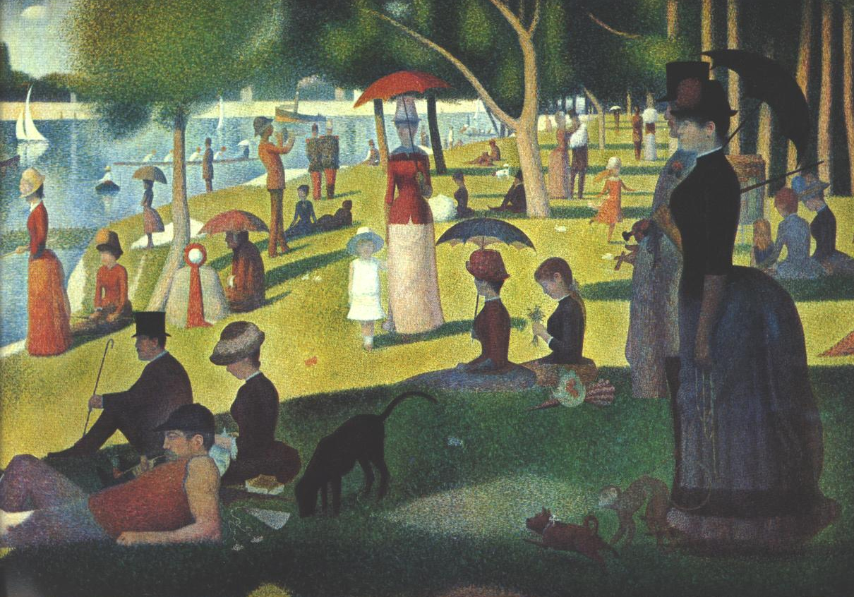
CMYK colors are created using four “ink guns” – cyan, magenta, yellow and black. Each of the four colors are deposited separately – one at a time – onto the paper, in various ratios, during the printing process. If you look through a magnifying glass at material printed in CMYK, you will see tiny dots of color. Imagine the famous pointillist painting by Seurat, “A Sunday Afternoon on La Grande Jatte”, this painting, as were all paintings in this style, was created with dots of color. The technique relies on the ability of the eye and mind of the viewer to blend the color into a fuller range of tones.

In contrast, Pantone colors are referred to as spot colors – a color generated by an ink (pure or mixed) that is printed using a single gun. Take that same magnifying glass you used to inspect your CMYK color and take a gander at a printed Pantone color. It will look smooth. Ofcourse there are some exceptions, when a Pantone printed piece will appear spotted or textured, but we’ll just save that for another discussion.

Pantone creates an enormous range of color for consumers to select from, many of which are complex enough that they must be blended by the company to achieve exactness. Others are mixed by your printer, prior to printing, based on the recipe and colors supplied by Pantone – an art in and of itself, which requires a high level of expertise.

In addition, Pantone colors utilize 13 base pigments (15 including black and white) mixed in specific amounts to achieve the spot colors they design – while CMYK has but 4 colors to work with. Despite this, the majority of the world’s printed material is produced using CMYK system. It’s a super star and what’s more it can be used on digital and offset presses. Pantone, aka PMS, is a bit more persnickety; she only likes the offset printer.

In that I don’t want to overwhelm you with information, we’ll touch on one last distinction between these dueling systems – color range. Pantone has 1,114 spot colors that cannot be reproduced using the CMYK system. Though many can be mimicked by that crafty ole CMYK, the result will not satisfy the discerning eye of some designers.

Over time, Pantone decided to provide translations of their colors with screen-based colors known as RGB (a red, green, blue system). These are the colors you see on your computer and that enormous flat screen TV you just purchased.

Now, it isn’t important that you understand the difference between CMYK, Pantone, RGB and PMS. The important thing is that your printer…or graphic designer does.

PrintingGreen is happy to take out the guess work – making it simple for you to simple press a few buttons and go – confident that your perfectly colored business cards will be delivered safely to your doorstep.

For color perfect printing in the most environmentally kind way possible, contact Printing Green. We are experts in color reproduction, green printing and all that falls between so you won’t need to be!

For more complex orders, contact our parent company Bacchus Press.

10/1/13

The Hazards of Spam Mail

Over 183 billion spam emails are sent hurling through cyber space each day, speedily making their way into your in box…or junk folder and more than likely filtered and directed into your trash.

These nifty titled ploys to garner some of your hard earned cash are not only annoying, but harmful and costly.

On the surface these miniature messages may appear innocuous, but it takes energy to generate, screen delete and store these pests – not to mention the havoc that could be wreaked upon your operating system after opening an infected one.

It is tough to measure the amount of energy consumed by a single piece of spam mail – but on a whole, they have been estimated to contribute greenhouse gases equivalent to over two billion gallons of gasoline each year. That would be equal to the carbon footprint of driving your car around the globe 1.6 million times.

And those computers we use to receive all these bits of spam often end up in landfills. Less than 20% are recycled. The remaining 80% are leaking lead, a large portion of which seeps into the water table.

Once these crafty sales pitches land in your inbox, or more likely your junk folder, the information is stored in a data center for as long as the message remains.  These facilities require an enormous amount of energy to heat, cool and power. According to the New York Times, data centers around the world consume more energy in one year than the entire country of Sweden.

In the midst of our rapidly advancing technology, we forget that everything has a cost. Even burning a CD or DVD generates 4 times the amount of CO2 than printing a 100 page four-color report. Those shiny little spheres are very difficult to recycle to boot!

One study by Swedish Researchers concluded that something as simple as reading the news on-line for 30 minutes a day produces more CO2 per year than producing a daily paper.  Yes, it actually produces less CO2 to create your news paper each day, all year long.  And frankly, curling up with the Sunday paper is far more appealing than a laptop.

There are so many choices to make in our daily lives which impact the environment – the implications of which may not even be apparent in the short term.  Fortunately there are many organizations, companies and products designed to minimize the impact of our modern life.

Next time you’re in the market for a new business card, brochure or otherwise – consider a Certified Green company like PrintingGreen.com, who offset their carbon emissions and provide Eco-friendly products produced in the most environmentally way possible.

PrintingGreen – one simple choice you can feel good about.

Do you have a more complex print job? Contact our parent company, Bacchus Press.
cleanair.org

Treehugger.com

09/1/13

What Does it Mean to be Certified Green?

There are no shortage of products and services making claims of being eco-friendly or touting the recycled logo. How does one go about verifying the environmentally friendly status of products and services without spending hours on research?

Simply purchasing a pack of recycled paper can be confounding. Not all eco-friendly papers are created equal; the percentage of post consumer waste used in the production is varied. All recycled papers are not created equal. Manufacturers make all sorts of claims without proper regulations being enforced.

Locating a an eco-friendly printer can be equally confounding.

Luckily, there are a quite a few organizations devoted to the protection of our environment – many of whom you can look to when choosing a printer. The high standards required to garner their affiliation and certification can act as a trusted guide, leading you to the very Greenest of Green.

Many printers claim to be eco-friendly, advertising recycled paper and soy/vegetable based inks. While these steps are important and certainly do make a difference, these alone do not a Green company make.

A Certified Green company, likePrintingGreen, has made significant changes to their business operation in order to pass a stringent set of requirements set forth by Green organizations.

For companies like ours, it can cost as much as $300,000 to become a Green Certified Business. Lighting, plumbing, electrical – these are just a few on a long list of upgrades necessary to ensure the highest conservation of energy and resources– thus reducing waste and carbon emissions.

FSC and Canopy are two prominent organizations who ensure the safety of our ancient forests and responsible forest management. If either of these logos are associated with the paper your printer provides, you can rest assured that they contain a high level of post consumer waste and come from responsible sources. Please note that just because your printer is FSC Certified, it does not mean that all of the paper they offer is FSC Certified. Don’t worry.

You can always ask your printer for advice. We are very helpful!

As if all of that wasn’t enough; let’s take a look as offsetting carbon emissions. Companies like Carbon Fund, offset energy consumption and carbon emissions by supporting third party projects directed at renewable energy, energy efficiency and reforestation. The dollars contributed through Carbon Fund help finance the future of alternative resources.

Next time you’re ready to place your print order, look toPrintingGreen. We take the guess work out of eco-friendly – providing printing you can feel good about.

For larger, more complex projects, contact our parent company Bacchus Press.

Until next week, keep it Green!

08/1/13

What are VOC’s and where do they lurk!


Volatile organic compounds (VOC s) are high vapor pressure, low water solubility compounds found in many manmade chemicals, many of which were associated with printing. The invention of UV dried inks instead of volatile based inks eliminated these toxic gases, resulting in a safer healthier work place and ozone.

Before you release a sigh of relief, let’s take a peek into where else these harmful acronyms run amuck. Printing is far from the only culprit.

It certainly doesn’t occur to most people to be concerned about the seemingly innocuous products they use daily, and quite liberally I might add. It wouldn’t even cross your mind that plugging in that delightful air freshener could cause hormonal abnormalities, birth defects and reproductive problems. But an incredibly high percentage of air fresheners tested by the NRDC (12 out of 14 to be exact) were found to contain highly toxic chemicals called phthalates. In addition, they may contain allergens and VOC’s, as well as cancer-causing chemicals such as benzene and formaldehyde. Yick!

On the bright side, your home smells like cherry chapstick.

One issue facing the US is deregulation. Its been claimed that this is due to big companies who would prefer to keep running business as usual and apparently Washington is all ears. Though I for one, am all in favor of no animal testing; there must be a way to regulate the products clearly hazardous to health. On the flip side of the coin we have the EU’s enforcement of strict regulations by way of the REACH Law drafted in 2007. The law requires that harmful chemicals be eliminated by companies who want to do business. As a result, the US has become the dumping ground for toxic toys, electronics and cosmetics that are continually being produced outside the US. Why not ship them here. We don’t have the protection of the REACH Law. Bummer.

Seriously, only about 5 percent of the chemicals found in the products we use have undergone even minimal testing for their toxicity or environmental impact.

Before you go rushing home to yank your air fresheners off the wall, let’s take a look at some of the other culprits lurking about your home – you’ll likely want to toss them while you are at it.

Let’s begin with all our vanity products. Vanity is acceptable; genetic damage…I dare say not.

There are a number of insidious characters nuzzled into that lovely eye shadow and vixen red lipstick. The same goes for hair color, deodorant, shampoo, toothpaste….the list goes on and on. It’s dangerous maintaining all that glamour. But please, do not use this as an excuse to forego the necessary shower.

Lead, a neurotoxin which typically occurs as a contaminant, such as in hydrated silica, an ingredient in toothpaste. Lead acetate is added as an ingredient in some lipsticks and men’s hair dye. It can cause brain damage and developmental delays even at extremely low concentrations. The average woman will ingest 6 pounds of lipstick in her lifetime. That’ll curb your appetite.

Other harmful ingredients include mercury, found in mascara and eye shadow, can cause neurological damage among other things. Talc, found in eye shadow, blush, baby powder, deodorant and soap, is known to act as a human carcinogen and has been directly linked to ovarian cancer. When inhaled it can behave similarly to asbestos and may lead to the formation of lung tumors.

Those are just a few.

Well, don’t get disheartened. There are plenty of beautifying products which won’t lead to the sudden and unexpected arrival of a third eye. There are plenty of retailers on-line – small companies like Mountain Rose Herbs or large companies like Amazon that offer Natural and Cruelty Free products.

I imagine once you liberate your bathroom, freeing it from the tyranny imposed upon it by the villainous beauty supplies, you’ll want to perform a good clean. Well you’ll likely want to add most of your cleaning products to the lead lined container you just hurled the vanity culprits into.

With merely a ratty old cleaning cloth remaining, you’ll next set out on the daunting task of replacing the scandalous cleaning agents with a friendly alternative. There are plenty of natural cleanser available and plenty of recipes, should you be so bold as to mix your own.

You and I could spend pages upon pages together, reviewing products we’d be far better off not using. But I have a feeling most of us likely know what these products are. They are the ones that burn your nose hair when you clean the shower and make your face peel. I’m sure Mother Nature loves to see those empty containers arrive at the dump.

The chemicals alone are hazards enough, but you and I are mixing and mingling these things in our home and crafting some crazy concoction that is likely resulting in some forsaken cellular mutation. I doubt seriously that it will produce anything as sexy as the X-men. You will not, I repeat not, come out of this looking like Storm or Wolverine.

If you’d prefer to age well, with your body functioning as optimally as possible and not hooked up to a respirator or tooling around on a rascal with a colostomy bag, then please people, take your health into your own hands. Rid yourselves of atleast a few of these ner-do-wells. I think I speak for everyone when I say; we want you strutting your stuff around town for years to come.

Printing Green and our parent company Bacchus Press – doing our best to keep it green.